Colour excites me. Harmonious or contrasting, dramatic & moody, or simply riotous. It’s the thrill it exerts in my being, the visual explosion inside my head. I feel a desire to replicate or capture the essence of that moment in some way.
Everything from our biology to our psychology to our culture and language shapes colour, which is as unique as each person’s perception of it. In western culture for example, we describe the rainbow as having seven colours. We like to categorise things for simplicity; however, it is a continuous spectrum and one in which the human eye can discriminate far more than seven colours.
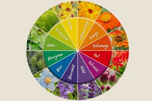
Colour theory is a practical set of rules that helps designers communicate their ideas through appealing colour schemes.

There are four basic colour schemes: monochrome, complementary, analogous, and achromatic. The last one means ‘without colour’ and refers to a scheme using a combination of blacks, whites, and greys. It is rarely used in garden planting schemes.
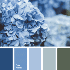
Often mistakenly referred to as black and white. It comes from the Greeks ‘mono’ meaning one and ‘khroma’ meaning colour. It creates a peaceful, calming effect. A monochromatic scheme means using one pure colour hue (for example, blue) in varying tones (the chosen hue + grey), tints (the chosen hue + white), and shades (the chosen hue + black).

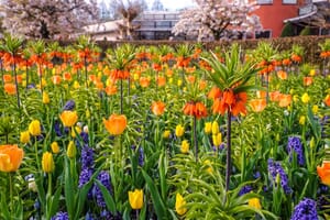
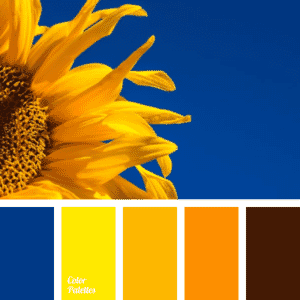
These colour schemes are those which are opposite each other on the colour wheel, i.e. Blue & Orange. They say “opposites attract”, so use this colour combination to stand out from the crowd. These colours look good together because the contrast and visual tension that they create catches the eye. The result is one that really pops.


These colours are those that sit either side of a chosen colour. The natural world often contains analogous schemes which are soothing and harmonious. If you want to create a zen-like space in your garden, then this would be the best colour combination.
A beautiful example of both these colour schemes is displayed in the garden we designed and built in Newent. The circular design incorporates separate, similar-sized borders, each with a dominant colour palette, with two much larger borders encircling these, that contain a blended mixture which helps to bring a sense of coherence to the whole design.
Reds and oranges are warm, dominant colours and blues and greens are cool receding colours. So, if you have a small garden and want to create a feeling of more space, use cooler colours as they recede and blur the boundaries, giving a sense of depth. Brighter colours by their very nature add drama, bringing a space closer, creating a sense of intimacy.
Colour perception changes according to the quality of light throughout the day and seasons. Strong sunlight will bleach out colours, so use brighter colours in sunny positions. Pastels look their best in morning light and whites seem to glow at dusk.
When we design planting plans for clients, we love to hear, “I feel energised and uplifted by yellow, it makes me happy!” or “I have a hectic working life. I need a tranquil, peaceful garden full of blues and soft mauve to help me unwind.” Many of us will have personal colour preferences, which we respond to on an emotional level. Although, much of our response is subconsciously conditioned by our culture and language.
There is no right or wrong colour to use in a garden; it comes down to personal preferences. However, if you’re not colour confident, following a few simple rules with the colour wheel will reap dividends.

